“A hedge-fund needing a revamp”
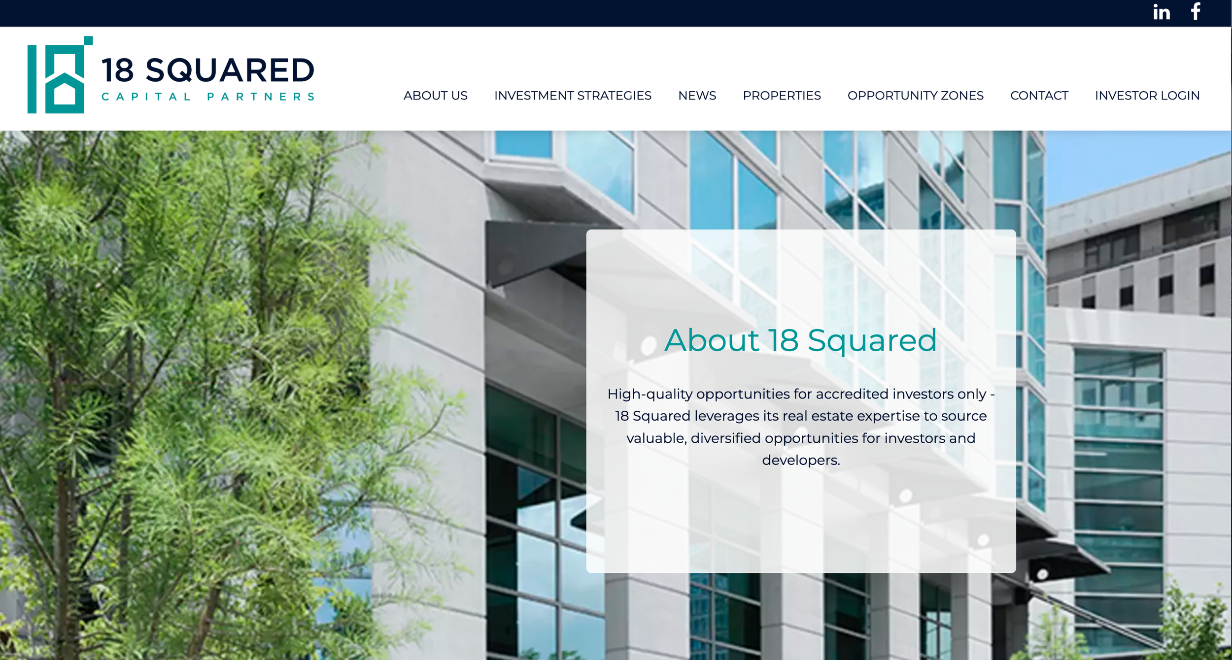
The financial firm was looking to start from the ground up!
NEW LOGO. NEW WEBSITE. NEW CLIENTS
Our objective was to take their real-estate expertise and distill it into laymen’s terms
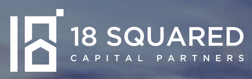
Which began with the logo!
The goal was to incorporate the number (a Jewish symbol of good-luck), a nod to real estate (is that a house??), and the idea of “squared” without saying the word.
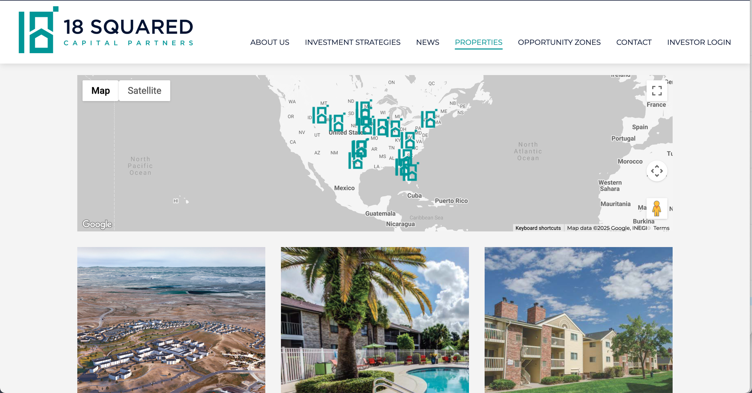
Working with a team of outside designers, I overhauled the website to make it simple, accessible, and digestible.
The company needed to attract new investors who had little experience in real estate…
Which meant doing research to make big ideas into small ones.